Friday 21 October 2011

intertitles and credits


Green screen:


Credit Blocks:


Using photoshop i made credit blocks and a green screen to go into my trailer. I got my wording from the Inception trailer for both images. On the green screen i used a range of bold and regular fonts to create emphasis on certain words. I also used the drop shadow tool to make the text look more 3D and stand up from the image. I changed the word 'America' to 'England' seeing as my film is a British film and to make it look more professional i used websites which act as a guide for the audience.

For the credit block i used the font 'Universal Accredited' which looks like the movie credits font. Lower case letters correspond to words such as 'written by' and 'directed by' so i was able to use the two line effect for the job titles and the stretched letters for names of the team. The text gradients from white to grey which makes it look more interesting than just plain text. For other parts I used the names of other people to make it look more professional to the industry as they have many team members whereas i am working on my own doing all the different job roles.

On the second credit block i designed simple logos for the three production companies i made up, i used the credit text with shapes. I also created a website name as every movie these days has their own website for promotional purposes.


Thursday 20 October 2011

Film Logo

My Sketches


This is the still of my logo, it represents the 2nd sketch i drew. On the animation the water will ripple in the sunlight.


This is the animated version of my logo:


After thinking about my logo, i don't think it suits the genre of my film trailer so i darkened the image using the opacity motion and added a black box over the red writing and used a smarter font that i also used for the intertitles and credits. This creates more continuity between the film, trailer and the production company.


This is my final film logo that i will use in the trailer.


In final cut this is how my film logo look with the layers on top of the original logo with the black box and the title of the logo.

Wednesday 19 October 2011

Filming


My first cut of filming was in a car park with Ashleigh, i cut all the shots up and selected the possible ones i will use, now i need to edit them together in chronological order according to my storyboard.

The successful shots i took were of Ashleigh facing away, looking over the edge when she suddenly turns around after hearing a noise.
I also filmed her running, which suggests she is being chased.

Monday 17 October 2011

Filming


Today i filmed some shots for my trailer. I took them in the local multi-storey car park. These shots were taken between half past 4 and half past 5, as i learned from my test shoots i needed to film earlier in the night so it's not too dark but isn't bright daylight.

I used a tripod to steady my shots and the handly to smoothly pan the camera around.The camera i used is my own fujifilm digital camera. The quality of images and video is really good and looks quite professional.

I took various shots taken from my storyboard such as my actor looking over the edge of the carpark and quickly turning around after hearing a noise. I also took a few panning shots of my actor running away and towards the camera at different angles.

Wednesday 12 October 2011

Magazine Images Editing


I like this image because it shows off the models features but doesn't give too much away. She is lookiing over her shoulder which makes the audience think that there is something behind her. The pose instantly creates recognition between her and the audience, they empathise with her and fear for her safety,


This is my favourite image of the two as i think it looks more inviting as you can see the model's full face and her expressions. She doesn't make eye contact with the audience which disconnects the relationship between them, but they audience empathise with her and see that she in focussed.

Poster Images Editing


This long shot invites the audience to look at the poster. The composition is effective with the subject in the centre of the image. Her body stands out from the black background. The black background connotes the dark, scary plot of the film. Her body language suggests she is vulnerable, her hands across her middle could mean that she is protecting herself. Her facial expression is very stern and serious, this connotes her strong focus but also show she4 is wary of the current situation.


This shot is taken from a higher angle which also connotes her vulnerableness as she looks smaller and looked down on my the audience. She looks over her shoulder to check whats behind her, this suggests she is wary and precautious. Her eyes cannot be seen by the audience which disconnects a relationship between them, however this works in favour of the film as they feel sympathy for her and wonder why she is so scared.


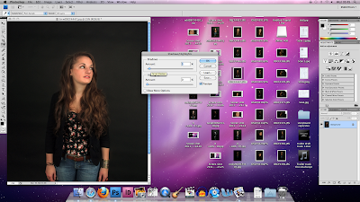
This is a medium shot, it doesn't show the full outfit of the model but it shows a closer shot of her face and her expression. Her clothing is trendy and casual suggesting she is a normal girl going about her everyday issues. Her eyes are looking up to the right which tells us she is watching out for something and her mouth is slightly open and showing slight fear. Her arms are by her side and open which also connotes her vulnerabilty in the film.