Wednesday 14 December 2011
Thursday 1 December 2011
Wednesday 30 November 2011
Tuesday 29 November 2011
Wednesday 23 November 2011


Thursday 17 November 2011


Wednesday 16 November 2011


Tuesday 15 November 2011


Sunday 13 November 2011
Credit Block - Poster

After doing my first draft for the poster i decided that the credit block didn't look professional enough. I went back to my textual analysis products and researched the professional credit block. I compared this to my own and added extra details where appropriate and also introduced the colour red as my audience suggested to add more colour rather than just white.
Print Product Feedback
I showed a draft of my print products two five members of my target audience and used their suggestions to to improve my work to suit their tastes.
Magazine cover:
Ross, 18: It looks good but quite plain, it needs more text on it to fill out the blank spaces and there needs to be more detail across the bottom of the page.
Ashleigh, 17: There is lots of black space on bottom left and title needs spaces in 'heads of tails' to make it stand out as separate words
Rachel, 17: The red lipstick is effective as it fits in with the colour scheme. The bold font for title is good too and i like the use of different fonts but they link together well. There is lots of blank space which you could fill in with another picture of more text. The 'plus' graphic and colour change draws attention in
Charlie, 19: It's really good, the eery scribblly font looks effective and suits the genre. All the text stands out from black background, although the bottom left is a bit empty, you should put more info in to cover it up.
Steph, 18: You should change the work 'or' into a red font so it defines the contrast between heads or tails, And rearrange the sell lines to frame the face of the actor and add banners behind the titles. What is the main article about?
Poster:
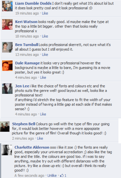
Ross, 18: It needs more colour other than white and you could maybe introduce theme of coin on poster that relates to the film or even the stalkers face behind her in the background as if she was being watched.
Ashleigh, 17: I like the way she fades into background. You could use a bit of red text within the white as this also suggests, blood, danger, death, hell. All of these things fits the genre more and have a continuity theme with the magazine.
Rachel, 17: professional credit block. Distinctive, unique font that fits the genre. The actor fades into the background which is effective. It doesn't hint at the storyline which could be good and bad. CCould also interpret a coin into the poster.
Charlie, 19: I like black and white and the way the actor blurs into background it looks creepy, as if she were lost. Although it needs more colour in the font.
Steph, 18: Do the same with the title by using a red to break up the words. Add a website too for the audience to link to.
Magazine cover:
Ross, 18: It looks good but quite plain, it needs more text on it to fill out the blank spaces and there needs to be more detail across the bottom of the page.
Ashleigh, 17: There is lots of black space on bottom left and title needs spaces in 'heads of tails' to make it stand out as separate words
Rachel, 17: The red lipstick is effective as it fits in with the colour scheme. The bold font for title is good too and i like the use of different fonts but they link together well. There is lots of blank space which you could fill in with another picture of more text. The 'plus' graphic and colour change draws attention in
Charlie, 19: It's really good, the eery scribblly font looks effective and suits the genre. All the text stands out from black background, although the bottom left is a bit empty, you should put more info in to cover it up.
Steph, 18: You should change the work 'or' into a red font so it defines the contrast between heads or tails, And rearrange the sell lines to frame the face of the actor and add banners behind the titles. What is the main article about?
Poster:
Ross, 18: It needs more colour other than white and you could maybe introduce theme of coin on poster that relates to the film or even the stalkers face behind her in the background as if she was being watched.
Ashleigh, 17: I like the way she fades into background. You could use a bit of red text within the white as this also suggests, blood, danger, death, hell. All of these things fits the genre more and have a continuity theme with the magazine.
Rachel, 17: professional credit block. Distinctive, unique font that fits the genre. The actor fades into the background which is effective. It doesn't hint at the storyline which could be good and bad. CCould also interpret a coin into the poster.
Charlie, 19: I like black and white and the way the actor blurs into background it looks creepy, as if she were lost. Although it needs more colour in the font.
Steph, 18: Do the same with the title by using a red to break up the words. Add a website too for the audience to link to.


Saturday 12 November 2011


Subscribe to:
Posts (Atom)