Wednesday 14 September 2011
Tuesday 13 September 2011
Sound Ideas
Using the sounds i originally picked out for my trailer i have chosen 4 sounds to layer up and form my trailer track. The sounds i have used are Bowling Strike, Volcano Eruption, Thunder Roll and Booming Reverse.

The sounds are layered to make the texture of the soundtrack really thick, the Booming Reverse sound will play each time the shot changes or an intertitle is shown. This is similar to what happens in the sound track from the Inception trailer. It creates suspense and keeps the audience interested.
I played my sound track to some members of the audience to get their opinion.
Charlotte said that it is really good and creates an air of suspense, you are constantly wondering what is going to happen next.
Steph said that the soundtrack is really intense and it builds up an eery atmosphere where you are waiting for something to happen.
Story Board
photos of doing the works and final piece scanned in with detailed description


The story board starts with a green screen like any other trailer i have watched, this informs the audience of the certificate given to the film which determines the age of the audience. Then the film cuts straight to the animated logo i have made, i may darken the tone of the logo so it fits better with the film genre. From researching other trailers i have found that the green screen and logo usually stay on the screen for approximately 4 seconds each. The first shot shown is a coin flipping through the air, then the camera zooms to show the audience what the coin has landed on. At this point in the film they aren't aware of the significance of the coin. The first inter-title shows the directors name, this zooms to enlarge the text and lasts for about 2 seconds.

The first shot shown of an actor is a girl, she looks like your average innocent looking girl. We see her scurrying onto her laptop and flicking through folders. Within seconds she has grabbed her bags and left through the door in a hurry. The close up of a mans feet are quite daunting, men are seen as strong and powerful over females and because we aren't sure of the actors identity is makes it even more scary about who this man could be.

The mans identity is still kept from the audience but a shot shows his hands searching for clues about where the girl could be heading and what she could be doing. The first hint is given by the inter-title 'what if' this still leaves the audience clueless about the storyline but creates tension as they can see the man his powerful by big hands and feet. The second inter-title is referring to the girl, she is hunting down people who have been chosen by the coin. The inter-titles zoom forwards and get bigger, then fade into the next shot. The girl can then be seen from behind, walking down a small, unlit alley way. She looks alone and vulnerable.

After a noise can be heard behind her she turns around and gasps, the camera then cuts straight into a wall where we see the mans foot just escaping out of the shot. Two consequtive inter-titles give a strong clue about the storyline. After the inter-title fades to the next shot we see the mans face however his identity is still hidden by a pair of binoculars. The shot straight cuts into a image through the binoculars, this creates the effect that she is being watched.

The fade between the two shots connotes the change of location, the girl is now looking over the edge of a multi storey car park, the camera zooms in on her and suddenly the runs. There is a close up of her face but the shot is unsteady as the girl is still running. In the darkness suddenly car headlights turn on and the screen fades to a black image where an engine noise can be heard.

Another inter-title gives another clue about the storyline but doesn't hint too much. The camera then tracks along a street showing the girl from the side running, followed by the mans feet which we recognise from the earlier shot. The editing pace speeds up as the action increases.

The intertitle breaks up a different change of location where the girl is still being chased. The screen fades to a black shot again while an extra sound effect can be heard, when the next shot is shown the girl is tied up in the corner.

As the trailer comes to an end the generic 'coming soon' is shown. Then the coin being flipped which will become an iconic logo of the film, while the coin flips into the 'o' of the film title. The shot then fades into the credits which includes actors names, producers, directors etc. The shot then fades to black and the music volume decreases into silence.
Flat Plans


The flat plan of the magazine cover features all the generic conventions of magazine covers. It shows the key information such as the barcode, price and date. The title of the film stretches across the full width of the magazine with a short effective tagline underneath. The title is a logo for the film and will feature on the poster and in the trailer too, using the 'O' as a coin is a pun about the title.
The main image is the main character, the girl who has physiological problems and feels connected to the coin that determines who she will follow on that day. The image is a close up on her face, she looks scared and vulnerable but also guilty.
The film magazine title is also a play on words for the genre, the text will be bold and brightly coloured to attract the audiences attention. The red black and white colour scheme is used on many films magazines, after performing my audience research i found these colours are very effective and attractive to my target audience so i decided to use this scheme for my magazine.
The sell lines tell the audience of other films featured in the magazine, the font will be smaller so it doesn't distract the audience away from the main image but so it still catches their eye when the look at it. The use of capital letters throughout make the text look more appealing and interesting. The + graphic also attracts the audience attention, it will be larger than the text and make them think they are getting extra features for their money.Attractive words such as 'exclusive' and 'new' are always appealing as the audience think that they won't see this information anywhere else, therefore they must buy the magazine.
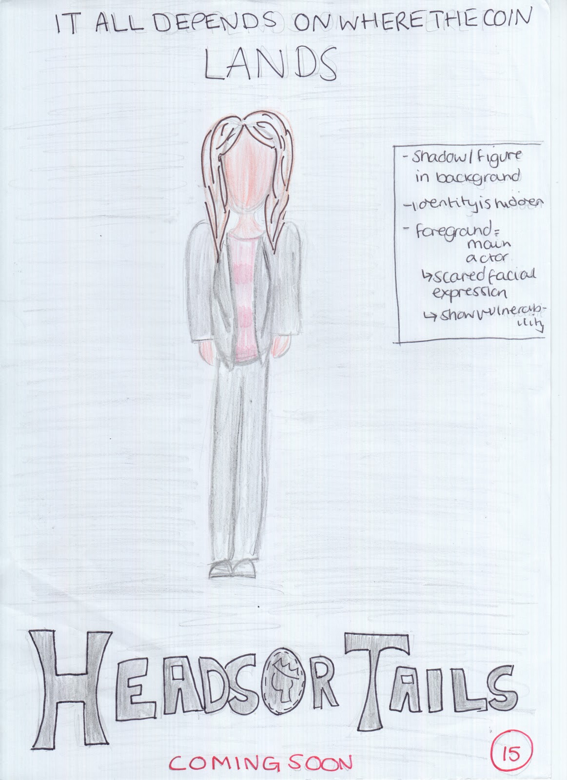
The film poster will feature a long shot of the main character in the darkness, there will be a hidden figure in the background which creates an eery, sympathetic feel for the film and the audience feel obliged to protect this girl and fear for her safety. Her costume is simple yet sophisticated, this encourages the audience to feel she is a good, well presented person. Her facial expressions connote her fear about the storyline which help feel empathy.
Across the top is a tagline that entices the audience into watching the film, it makes them question what they think the film will be about and encourages them to use their imagination. The title of the film is used throughout the three pieces which makes it more into a logo and promotes recognition from the audience. The bold black text may not stand out from the dark background so i think i will change it to a contrasting white. Underneath is the words 'coming soon' in a capitalised red font, this doesn't inform the audience of the exact release date but makes them interested and check back later to see when it will be released.
Underneath this will be the credits that feature the actors names, production companies, music, directors, writers etc. I will perform some research to see how the credits are usually displayed and what the content is.
In the corner is the certificate given to the film, it is rated at 15+ which connotes to the audience that there is unsuitable scenes for children and younger audiences.
Saturday 10 September 2011
Spy Trailer Research
There is no green screen on this trailer, it cuts straight into the production company's logo and the soundtrack which is a happy melody. The scene is set in the mountains with lots of conifer trees, the shots are fast and fade to black inbetween. Up until the 19th second the film trailer could pass for a romantic drama but as the black fade comes across the sound turns more eery and a sound bridge encourages the audience to use their imagination while there is no picture on the screen. The heightened sound effects with the trigger and the gun shot adds action and tension to the storyline. Seeing the view from inside the gun with the crosshair aiming towards something makes the audience feel powerful and also connected with the main character. The use of a helicopter makes the film look of a higher budget. The varied transition between shots is really effective, i especially like the one with the vertical lines as it fits the genre well and makes it look more 'gadgety' but also feels as if they are being watched. Using binoculars as props connote that they are spying on someone. I didn't think of using this as a prop but i think it has proven quite effective. In the inter-titles the letters change between letters and numbers before finishing on the chosen word, this makes the film look high tech and is a generic convention from spy films.
The explosion is a really loud sound effect, although you can't see the actual explosion the shot on screen where the crowd is all ducking for cover leads the audience to believe they are under attack. There is a short moment of silence which allows the audience to build up even more tension before another gun shot and a man gets blasted out of a window. The editing pace quickens as the action picks up, there are loads of sound effects used which creates more fear for the audience and keeps them waiting for what will happen next.
The shots change between person shots in the characters own house with his girlfriend and action filled shots where helicopters are being blown up and people are hijacking vans. The personal shots allow us to connect and empathise with the character which is then used in the action shots and we feel protected by him but also scared for what he may do next.
The title of the film is revealed at the end of the trailer, ironically as a trigger is being pulled the shot changes to the film title which leaves the trailer on a cliff hanger. The audience are wondering what has happened after the trigger has been pulled.
Friday 9 September 2011
Pitch Reflection One


After performing my pitch the negative feedback i recieved was mainly due to my trailer ideas not matching my research, therefore i have decided to change my idea of trailer to make it fit more with the research i did. Following this i have gone back to my research and added extra things, i have analysed the screen shots taken from film trailers via youtube in more depth by looking at the composition, mise-en-scene and what sound is used. Using the forms and conventions of professional texts i have analysed my own test shoots with this. I have also analysed more trailers that fit the thriller genre to give me more ideas for my trailer and to make sure i can make mine look as professional as possible.
I was told that there were many holes in my research and i had diverted off my original path, to make my research stronger i have focussed on films that fit my idea.
Many people said they liked the idea of using a car in my trailer, this would make it more professional however they said they would like to see more shots that make the audience jump to keep them interested and use twists so the storyline isn't too predictive.
Given this feedback i have decided i will research more into the genre of thrillers and perform more test shots with film rather than just still images.
Wednesday 7 September 2011
Friday 2 September 2011
Subscribe to:
Posts (Atom)