The flat plan of the magazine cover features all the generic conventions of magazine covers. It shows the key information such as the barcode, price and date. The title of the film stretches across the full width of the magazine with a short effective tagline underneath. The title is a logo for the film and will feature on the poster and in the trailer too, using the 'O' as a coin is a pun about the title.
The main image is the main character, the girl who has physiological problems and feels connected to the coin that determines who she will follow on that day. The image is a close up on her face, she looks scared and vulnerable but also guilty.
The film magazine title is also a play on words for the genre, the text will be bold and brightly coloured to attract the audiences attention. The red black and white colour scheme is used on many films magazines, after performing my audience research i found these colours are very effective and attractive to my target audience so i decided to use this scheme for my magazine.
The sell lines tell the audience of other films featured in the magazine, the font will be smaller so it doesn't distract the audience away from the main image but so it still catches their eye when the look at it. The use of capital letters throughout make the text look more appealing and interesting. The + graphic also attracts the audience attention, it will be larger than the text and make them think they are getting extra features for their money.Attractive words such as 'exclusive' and 'new' are always appealing as the audience think that they won't see this information anywhere else, therefore they must buy the magazine.
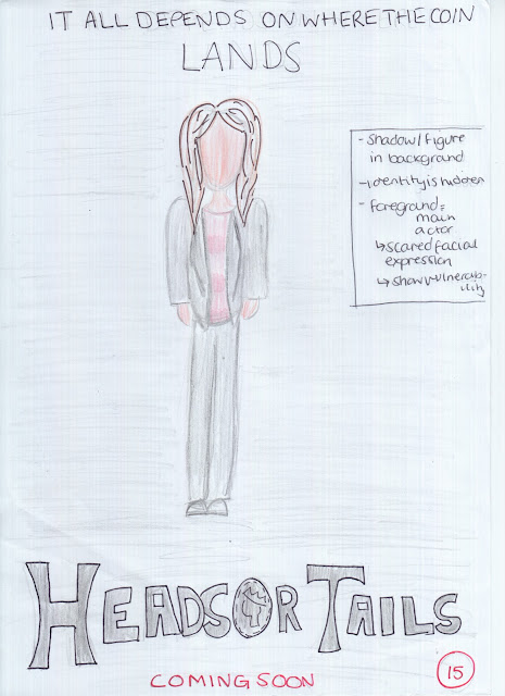
The film poster will feature a long shot of the main character in the darkness, there will be a hidden figure in the background which creates an eery, sympathetic feel for the film and the audience feel obliged to protect this girl and fear for her safety. Her costume is simple yet sophisticated, this encourages the audience to feel she is a good, well presented person. Her facial expressions connote her fear about the storyline which help feel empathy.
Across the top is a tagline that entices the audience into watching the film, it makes them question what they think the film will be about and encourages them to use their imagination. The title of the film is used throughout the three pieces which makes it more into a logo and promotes recognition from the audience. The bold black text may not stand out from the dark background so i think i will change it to a contrasting white. Underneath is the words 'coming soon' in a capitalised red font, this doesn't inform the audience of the exact release date but makes them interested and check back later to see when it will be released.
Underneath this will be the credits that feature the actors names, production companies, music, directors, writers etc. I will perform some research to see how the credits are usually displayed and what the content is.
In the corner is the certificate given to the film, it is rated at 15+ which connotes to the audience that there is unsuitable scenes for children and younger audiences.


No comments:
Post a Comment